
A guest posting by Léon Macduff

Well now, flimflamfan‘s laid down a bit of a challenge here. Have I ever bought a record purely on the basis of its sleeve? Certainly there are many records in my collection where the music is great but the design makes the package even better, but mostly it’s stuff I’d have bought anyway even if it came in a plain white bag. There is however, one purchase that I think I can honestly say I would not have made were it not for the sleeve design. And I can say that because, alarming though this may be to some readers, I’ve never really got into XTC. I don’t dislike them, in fact I know and like quite a few of their singles, but I’ve never delved particularly deeply into the catalogue, and I wouldn’t have shelled out for this LP either were it not for the fact that I really like the packaging.
I must have bought this album in… probably 1995. Maybe ’96. And what I should explain up front is that while I was completely ignorant of the LP, I did sort of recognise the design. I had previously seen it adapted as a fanzine cover, but I didn’t get the reference until I happened upon the original on a market stall in Leicester.

I reckon I would have paid perhaps a fiver for the album, maybe not even that much. The sleeve was the work of celebrated design partnership Hipgnosis, and the record, released in 1978, was XTC’s second album, Go 2. And this, photographed from the very copy I bought from the market that day, is the sleeve design…
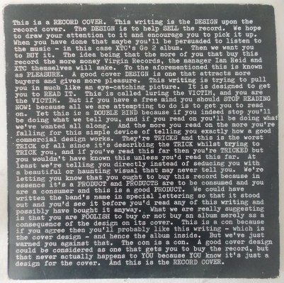
Yes, it’s a wall of text, and yes, the one album I bought because I liked the cover is specifically mocking people who buy albums because they like the cover. So more fool me, I guess. But it is quite funny, and it carries on like this on the back.
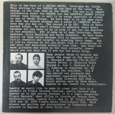
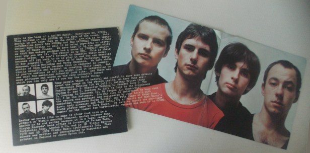
Having previously seen an adaptation of the front cover, what a discovery this was! I had thought the fanzine cover was something original, but now that I knew the truth it didn’t feel like I’d been cheated, it felt like I’d been let in on a secret. But take a close look at that back cover and you’ll notice that there’s a chunk of text missing. It’s not a misprint; nor is it, despite the poor quality of my photography, an error on my part; it’s exactly as it should be because the missing text is on the promised “very colourful” insert. And because I was buying it second hand off a market stall and not shrink-wrapped new, I could open it up and see it for myself.
You may think it’s a bit smart-alec to have the text “wrap through” onto the insert, using this to get the catalogue number onto the insert AND referencing the fact that they’re doing it. And maybe it is, but I think what it shows is that they’ve really thought about this and gone for it. This, as noted elsewhere, is called DESIGN CONTINUITY. Where is this noted? On the actual labels…

Yes, they really have carried this through the whole package. I mean, seriously, the WHOLE package. And the pièce de résistance is…

Marvellous. However, it has to be said that the design has very little to do with the record in any artistic sense. The album is XTC, the sleeve is Hipgnosis, and the connection is… tenuous. Indeed, it feels like a generic template where they’ve just filled in the gaps – which, according to a snippet that started appearing all over the web when the LP was reissued earlier this year, is exactly what happened.
I am a bit wary of any information on the internet that is always expressed in the exact same words wherever you see it, but the fact as found on various websites – and now this one! – reads as follows: “Contrary to popular myth, Go2’s distinctive sleeve was not specifically commissioned for the band. It had been pre-designed by third partner at Hipgnosis (co-founder of Throbbing Gristle and Industrial Records) Peter Christopherson and simply awaited a client/band willing to choose it.” To which I can only respond: yeah, that figures.
Something else I only found out in the course of writing this piece is that there was a different “essay” on the UK cassette. It was done in-house at Virgin and wow, what a half-assed job they did on it.
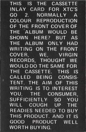
The best thing I can say about that is that they managed to get it so wrong that at least it helps me to crystallise what Hipgnosis did right. The LP sleeve looks pointedly anti-design but it really isn’t. The style is elegant, the content is witty. The jokes are to some extent against Virgin but mostly against their own work as designers. Even when they do mock you, the potential customer, you’re in on the joke. And as we’ve seen, they really commit to it. Virgin’s in-house knock off achieves none of that. It’s cheap, and it looks cheap. The sans serif, all-caps typeface is just shouting at the (potential) buyer, the gappy justified text is ugly, the jokes fall flat (the delivery is completely different when the text reads “THIS IS CALLED BEING CONSISTENT” rather than “This is called BEING CONSISTENT”), the “cough up the readies” line is way too blunt, and what the hell is that question mark doing in there? They don’t follow through, either: apart from the front panel, it’s just the same as any other tape inlay (and no, there’s nothing special about the labels either). The cassette card is the hackwork of someone trying to do their own version of the LP sleeve but who has completely failed to grasp the thinking behind it.
Going back to the LP, I will briefly note here that the reverse side of the gatefold insert is the part that breaks away from this style – it’s the bit where the band members get their own input, including Colin Moulding‘s map of Swindon which seems quite popular. It’s a proper hand-drawn street map, but with symbols marking key locations like “Place of Sickness”, “Place of Hallucination” and “Place of Virginity-Loss”. It’s quite amusing, but that alone wouldn’t have persuaded me to part with my cash.
As for the music… um, it’s alright I guess. The album seems to be XTC’s least well-regarded so I don’t feel too bad about being a bit lukewarm toward it. As the rushed follow-up to their well-received debut White Music, Go 2 is XTC’s This Is The Modern World, their Pretenders II, their Lionheart. It contains no hits; in fact, in contrast to the debut which spawned the singles Statue of Liberty and This Is Pop, nothing on the LP was deemed worthy of a 45 release at all, which pretty much tells you all you need to know. It’s not bad, but on this evidence you wouldn’t have bet on them still being around five years later, let alone ten or twenty.
Here, have a couple of tracks anyway. The first is written by Andy Partridge, the second by Colin Moulding. It seemed only right.
mp3: XTC – Meccanik Dancing (Oh We Go!)
mp3: XTC – Crowded Room
So yes, I think I can honestly say that this is an album I only bought because of the cover. It’s also an album that I continue to hold onto because of the cover. Well, the cover and the insert and the labels and the rubber-stamped inner bag. But sadly – and it is sadly, because while I may not be a major fan, I do recognise that they went on to far greater things – really not because of the music.

I thoroughly enjoyed that… the LP bought for the cover art and the history behind the cover art (with additional info about XTC).
Off the shelf design that is that well thought through but awaits a client – I like that idea. Pop art if Warhol had identified and monetized it.
I have a gnawing annoyance re: Hipgnosis. I know the name but can’t place the associated band/art work. I looked online – Peter Gabriel, T-Rex, I dunno.
Flimflamfan
Over the weekend I watched a couple of potentially relevant documentaries – XTC: This Is Pop (which manages to cover Barry Andrews leaving the band without actually mentioning Go 2 at all, so not amazingly relevant to this though I’d give it a thumbs-up nevertheless) and the recent Hipgnosis: Squaring The Circle in which it is noted that Hipgnosis co-founder Storm Thorgeson would often recycle rejected ideas until someone took them. So it wasn’t just this one after all! Co-founder and last-man-standing Aubrey Powell seems to think Thorgeson was a bit cheeky in this but doesn’t exactly disapprove.
One takeaway from H:STQ that may interest readers here is Peter Saville mentioning the parallels between Hipgnosis’ sleeve art for Pink Floyd’s Dark Side Of the Moon (you know, the prism) and his own for Joy Division’s Unknown Pleasures. He says they’re both scientific data so they don’t age. I can’t really argue against that.
Léon Macduff
What a great read! I remember seeing the Go2 album in shops and not knowing what to make of it. First time seeing the ‘colorful insert’. I used to think XTC really got started with Drums and Wires but now I’m re-thinking that idea. An excellent post to start off the week!
By strange coincidence, I remember seeing the album in Ainleys record shop by the side of the market in Leicester back in the day and starting to read but not finishing the sleeve- and who says a short attention span is a modern thing